
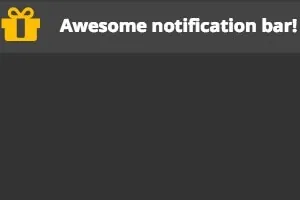
In this post, I will show you on how you can build a Sticky Notification Bar for your website. A notification bars can be a effective way to grab the attention of the visitors and show to them some important information or even promoting your product. Also is a powerful way to increase the number of your subscribers. Notification Bar:
See the Pen Sticky Notification Bar by Andreas Eracleous ( @Sp00ky ) on CodePen .
How Sticky Notification Bar works
Simply the Notification Bar appears on the top of the website using CSS3 animation properties for adding some effects on the bar. At the beginning of the website, the bar is appearing smoothly from up to down and therefore if the user click on the close button icon, it is disappearing from down to up. After that, a narrow icon is appearing to the user where has the option to brink the bar back in the initial stage.
How to create CSS Click Events
The Close button works only with CSS selectors without any interaction of Javascript code. So in order to make it happens we need to know two values like true: when the button is clicked and false: when the button is not. I used an input html tag of type Checkbox in which it give us two values true :when it checked and false :when it unchecked. As you can see the code below:
<input type="checkbox">
In the style code:
  input [type=checkbox]:checked ~ #notification-bar  {
/* Make something when it checked  */
}

input[type=checkbox] ~ #notification-bar {
/* Make something when it unchecked  */
}
The above CSS code, basically the [fusion_highlight]sibling selector ~[/fusion_highlight] it says to do something with the element id=“#notification-bar” that is below of the input tag. In this case when the checkbox is checked, it starts to run the animation to disappear the bar.
Animation - CSS3 3D Transforms
Using the transform property, it gives the ability to control an element using 3D transforms including X, Y, Z axis (translate3d(x, y, z)). In our case I have used only the Y axis , moving the bar from -100 to 0 (Up to Down) pixels on the Y axis and 0 to -100 (Down to Up) pixels.
  /* ANIMATION for go up */
@-webkit-keyframes goUp {
  0% {
    -webkit-transform: none;
            transform: none;
  }
  100% {
    -webkit-transform: translate3d(0, -100px, 0);
            transform: translate3d(0, -100px, 0);
  }
}
@keyframes goUp {
  0% {
    -webkit-transform: none;
            transform: none;
  }
  100% {
    -webkit-transform: translate3d(0, -100px, 0);
            transform: translate3d(0, -100px, 0);
  }
}
/* ANIMATION for go down */
@-webkit-keyframes goDown {
  0% {
    -webkit-transform: translate3d(0, -100%, 0);
            transform: translate3d(0, -100%, 0);
  }
  100% {
    -webkit-transform: none;
            transform: none;
  }
}
@keyframes goDown {
  0% {
    -webkit-transform: translate3d(0, -100%, 0);
            transform: translate3d(0, -100%, 0);
  }
  100% {
    -webkit-transform: none;
            transform: none;
  }
}
Source Code
The source code is available in this repository on GitHub.